Minimalism in art and design is more than just a style—it's a philosophy with a strong focus on simplicity and intentionality. This timeless approach resonates across industries and continues to captivate audiences.
This article explores the core principles of minimalism, its distinguishing features, and practical tips for creating minimalistic designs. Read on to learn more!
What exactly is minimalism in art and design?
Minimalism in art and graphic design is a style that focuses on simplicity, clarity, and the use of essential elements to convey certain meanings or create a specific atmosphere. It avoids excessive details and instead focuses on clean, deliberate compositions.
It isn't, in fact, one of the most innovative tendencies like the ones described in the Depositphotos design trends blog post—instead, minimalism is one of the permanent styles, the popularity of which doesn't lessen as time goes on. For instance, 64% of consumers are more likely to recommend a brand that has a simple logo design.
Common characteristics of minimalistic design and art
Minimalistic graphic art is focused on the essence of forms, reducing or excluding narrative, symbolism, or emotional excess. This art is characterized by simple geometric shapes, a limited (often monochromatic) color palette, a focus on raw materials, patterns, or repeated elements, and lots of negative space. The most well-known examples of minimalist art are works created by Donald Judd, Agnes Martin, and Dan Flavin.
The goal of minimalist graphic design, on the other hand, is to come up with simple yet efficient ways to present ideas visually. To achieve this, designers create uncluttered layouts with only necessary elements, use limited colors and clear fonts and grids, and make strategic use of negative space. Some famous examples of minimalist graphic designs are the Nike logo and Apple product packaging. Also, you can find minimalistic vectors at Depositphotos that may inspire you.
Both minimalist art and graphic design share the same principles:
- Every visual element has to be there for a reason.
- The work should highlight the subject or message without distracting viewers with unnecessary elements.
- Simple designs and art are less likely to become outdated.
Tips to efficiently create simple design graphics
To design simple yet impactful graphics in a minimalist style, you must pay attention to details, balance, and purpose. Here are the practical tips that will help you achieve this.
1. Start with a purpose
First, you need to identify the core idea or message that you want to convey with your design. Then, you need to eliminate anything that doesn't support that message.
2. Use negative space mindfully
The empty space around your design needs to help viewers focus their attention on the design's key elements. Therefore, you should avoid adding extra details or trying to fill every inch of the canvas. Instead, let your design "breathe."
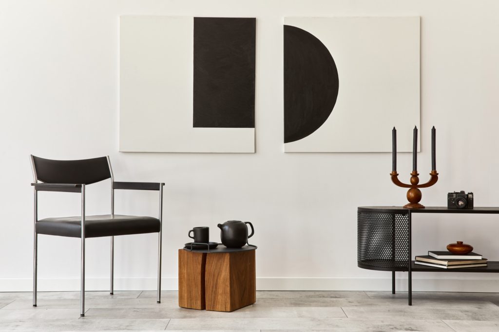
3. Go for a limited color palette
You can opt for a neutral palette with one or two accent colors or try a monochrome design. In fact, it's a good design practice to create your visuals in black and white first before adding some color, as this helps you understand how the design looks without any distractions. In any case, make sure that the chosen colors offer high contrast for readability and emphasis.
4. Use simple typography
Decorative or overly stylized fonts are generally not the best fit for minimalist designs. Instead, opt for a sans-serif font or a simple serif with clean lines, and try using no more than two font families and sizes (for instance, headline and body text). In fact, this tip applies not only to minimalist designs. Although creators generally use between three to five fonts, this approach usually applies to complex design pieces: product catalogs, infographics, presentations, and landing pages. Other designs usually benefit from having no more than three fonts.
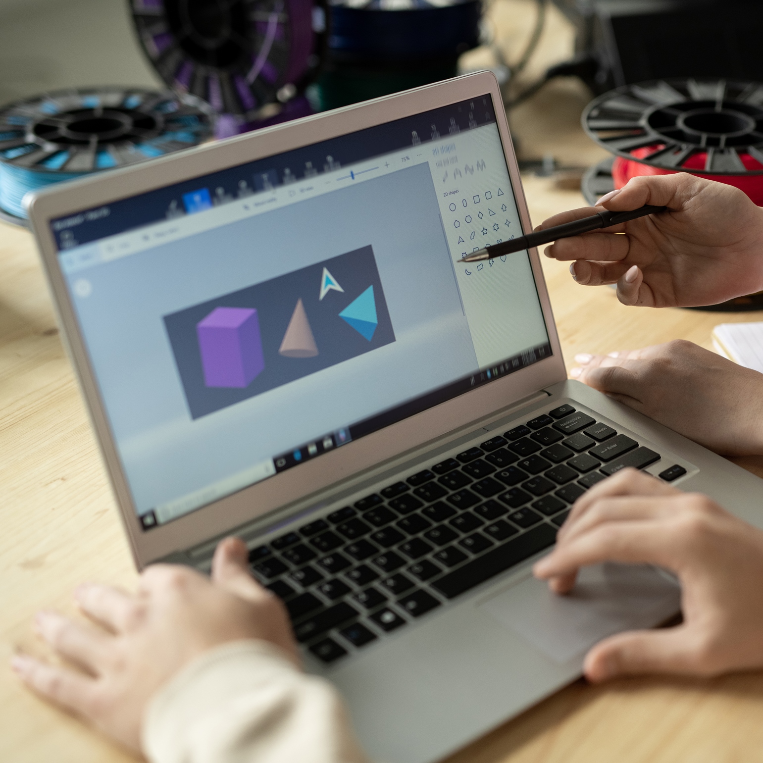
5. Focus on basic shapes
Use geometric forms like circles, rectangles, or lines to create structure. Try to keep shapes uniform and avoid unnecessary textures or embellishments.
6. Use a grid system
A grid system helps designers maintain structure and balance in their creations. Grids create harmony and ensure spacing (such as the distance from the logo outline to the frame's border) is consistent across the design.
7. Make visual hierarchy your priority
To achieve this, ensure that the most important elements are larger, bolder, or more prominent. You can also use size, weight, or position to guide the viewer's eye.
8. Refine your design
Once a design is complete, try editing it further. For instance, you can remove unnecessary details or redundant elements. Aim for simplicity without losing meaning or functionality.
9. Add subtle accents
Thin lines, small shapes, or slight gradients can add depth and interest to minimalistic design; however, you should use them sparingly. Also, try using subtle animations (if you're creating digital designs). They can also add polish without overwhelming simplicity.
10. Test your design
Once you've finished, step back and view your design as a whole. Ask yourself if it feels cluttered or balanced. If possible, also show it to someone unfamiliar with the project to see if the message is clear.
To sum up
Minimalism isn't just a fleeting design trend; it's a timeless approach that prioritizes clarity and functionality. Focusing on essential elements and removing distractions will allow you to create minimalistic designs that are both impactful and enduring. Embracing the principles of minimalism can help you communicate ideas effectively and maintain elegance at the same time. Remember: simplicity is powerful when done with purpose.