

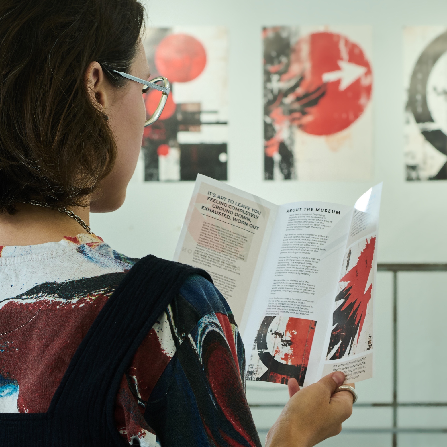
The opinion formed by visitors about the exhibition starts long before they encounter the first work of art. The door, outdoor signage, posters, and ticket booth are usually the first places to make an impression on the opinion. People will know what's going on and what the theme and mood are before they enter. The Museum of Modern Art in New York, Tate Modern in London, and other art institutions have a consistent typography, colors, and graphics on all points of contact with the visitor, and this makes it easy for the visitor to have a smooth experience in the museum.
Guiding Visitors Through the Exhibition Space
Visitors enjoy an exhibition more when they can move through it without stopping to ask for directions. Good visual branding is not only about appearance. It also helps people understand where to go next and what they should see. Simple maps, clear wall signs, and consistent symbols make the route easy to follow. Color can separate exhibition zones, while readable typography makes labels quick to understand from a comfortable distance.
Many cultural events also use company banners for events to identify sponsors, welcome guests, or highlight special exhibition areas. When these banners follow the same visual style as the rest of the exhibition, they support the visitor experience instead of distracting from it.
Good navigation should include:
- Clear entrance and exit signs
- Easy-to-read floor maps at key locations
- Consistent icons for restrooms, cafés, and information desks
- Directional signs placed before visitors need to make a decision
Research from the Nielsen Norman Group has consistently shown that clear wayfinding systems reduce visitor frustration and improve overall user experience in public spaces. The same principle applies to museums, galleries, and cultural festivals.
Creating Strong Connections Between Artwork and Exhibition Design
The ideal exhibition arrangement takes into account the artwork rather than working against it. Each design element should serve a purpose of directing the viewer to the collection and support its story. Panels, lighting, colors, and graphics all play a part in helping people "see" what they see.
Neutral walls and simple display systems are often used to ensure that the images are the top priority in a photography exhibition, for instance. Traditional fonts and warm colors may be employed for historical exhibitions to reflect the time period being shown. Many modern art galleries employ clean designs, with little graphic material, to provide ample room for the pieces of art.
There are common features that are essential to a successful exhibition design:
- Position structures to match the theme of the exhibition
- Artwork lighting, which is not distracting
- Uniform style of typography for all labels and information panels
- Enough open space to prevent visual clutter
- Other areas designated to encourage photo opportunities without obstructing pedestrian traffic
The one thing that always comes to mind during a visit to a museum or a trade exhibit: visitors don't really pay attention to the great design of the exhibit because it's all just so natural. They walk around easily, enjoy the museum's exhibits, and recall their visit long after they go home. The secret of that quiet success is in their visual branding that is consistent along the entire journey.
Extending the Exhibition Experience Beyond the Venue
An exhibition should not end when the visitors leave the building. A strong visual brand will make it easier for people to recall what they have seen and keep them engaged with the museum, gallery, or festival. All graphic elements and treatments, colors and fonts, should be consistent between all printed and digital products.
There are simple steps that can extend the visitor experience:
- Create social media content with the same graphic style as the exhibit
- Design brochures and postcards in artwork or event colors
- Create photo areas that fit the exhibition theme in a natural way
- Make sure it's the same brand on websites, newsletters, and event apps
A great example of this is the annual Art Basel, where the same look is maintained throughout event guides, websites, and signs. Official materials are easily identifiable before, during, and after the event.
Strengthening the Identity of Museums, Galleries, and Cultural Festivals
Visual branding isn't a mere formality. It assists in the creation of a public presence by cultural organizations that are identifiable from one event to another. Each exhibition is identified by a recognizable logo, color palette, and design style, making it feel like part of a larger story.
The effective organization uses the same approach to the design of many of its touch points:
- Exhibition posters
- Event tickets
- Museum maps
- Staff clothing
- Gift shop products
- Official websites
Tate museums in the UK offer a good example. Their visual identity remains the same for exhibitions, but each exhibition features its own creative style. Official communication is instantly identified by visitors without being mixed in with external promotions.
Such an approach works well for cultural festivals too. In today's day and age, sponsoring, partnerships, and local involvement with logos should be allowed, provided there is clear branding. Consequently, all communications work to reinforce the image of the institution rather than vie for it.
Common Visual Branding Mistakes That Reduce Visitor Experience
Great art can fall flat when it comes to visual branding. Organizers often run into problems when they're thinking about the individual design elements and not the overall visitor experience.
Common mistakes include:
- Having too many different colors and fonts
- Setting up signs out of view
- Printing labels too small to comfortably read
- Applying various design styles to print and digital media
- Providing sponsors more visual recognition than the exhibition
These problems are avoided through the use of a simple design system. Clear navigation, readable information, and consistent branding keep visitors focused on the art instead of hunting for directions and understanding conflicting visual messages.