

A painting that looked alive in the gallery can turn flat the week it goes up at home. Nothing about the frame changed. Wall color usually takes the blame, and it's almost never the wall.
It's the lightbulb. Light color is measured in Kelvin. The difference between a 2700K bulb and a 4000K one is enough to change which pigments step forward and which sink back. It costs nothing to fix, other than reading the box at the hardware store.
Getting it wrong is the sort of mistake that hangs on a wall for a decade while everyone quietly assumes the painting was always a little disappointing.
Warm Light and Cool Light Do Different Jobs
Low Kelvin numbers give you warm, amber-leaning light. High numbers push toward blue-white. A 2700K bulb lands close to old incandescent light, 4000K reads as neutral office white, and anything at 5000K or above is what packaging calls daylight.
Warm light is good for reds, ochres, browns, and skin tones. It also drowns out the blues and greens, which can leave a cool-toned, abstract-looking muddy. Cool light does the opposite: it sharpens whites and blues, and it bleaches out a warm palette until a golden landscape reads like a photocopy of itself. Neither one is right. It depends on what's hanging there.
Separate Ambient Light from Display Light
Before you settle on a bulb, count how many lighting jobs the room actually has, usually two.
Display light points at the work. Ambient light fills everything else so the room is comfortable to sit in. Try to cover both with one overhead fixture, and you're stuck choosing between a room that feels like a bunker and a painting that's soaking up more light than it should.
So, give the room its own source, positioned to fill the space without aiming at anything hanging. Low-output wall pieces handle this well, since they sit below eye level and cast light away from the hanging wall rather than onto it.
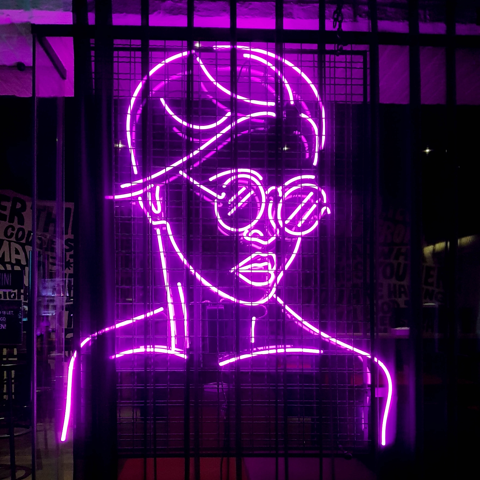
A dimmable sconce does the job. So does a custom LED sign in a corner or down a hallway, which runs cool, pulls almost no power, and dims far enough to read as glow rather than glare.
Once the layers are separate, everything after this gets easier. Set the room to whatever brightness feels right, and treat the light landing on the art as its own question.
Why Museums Prefer Warm Light Around 2800K
Galleries have leaned warm for decades. The Northeast Document Conservation Center puts the museum community's preference at roughly 2800K, with the caveat that this holds when overall light levels are kept low. Cooler light in the 3500K to 5000K range raises contrast, which NEDCC notes can be desirable but can also change how an object looks.
There's a perceptual reason sitting underneath the conservation one. Dim and cool together feels bleak, so when a gallery drops brightness to protect the work, warmer light keeps the room from reading like a walk-in refrigerator. The same logic applies at home. Rooms lit at low levels do better on the warm end of the spectrum.
CRI Matters More Than Kelvin for Color Accuracy
Color temperature tells you the flavor of the light. Color Rendering Index tells you whether it's telling the truth.
CRI is a rating from 0 to 100 that indicates how true a source's color rendering is to a reference. Energy Star-rated bulbs pass 80, and many household lights are right at that line, which is also where art starts to look a little off for no obvious reason.
The Canadian Conservation Institute recommends a minimum of 85 and notes that many museums specify above 90. CCI is also blunt about there being no international standard, so treat these as working guidelines rather than law.
Worth asking about R9 as well, the sub-metric covering saturated red. Reds are where cheap LEDs fail first, and reds run through portraiture, warm abstraction, wood tones, and anything sitting under a varnish.
How Much Light Your Artwork Can Safely Take
Brightness carries its own risk. NEDCC is direct about why: light damage is cumulative and irreversible, so a faded photograph won't recover in the dark. It just pauses.
CCI's long-standing guideline sorts material by sensitivity:
- Highly sensitive (textiles, watercolors, photographs, leather): 50 lux
- Moderately sensitive (oil paintings, wood, bone): 150 lux
- Insensitive (ceramics, metal, stone): 300 lux
For scale, NEDCC puts 50 lux at roughly the level of a living room in the evening and standard office lighting at around 400.
LEDs help here. NEDCC assesses that LEDs don't emit UV or IR, which removes two of the three damage routes from consideration compared with tungsten and quartz-halogen fixtures. Visible light still does its work, though. Dimming isn't optional.
Test the Light Before the Art Goes Up
Bulb color is nearly impossible to judge from packaging. Buy one of each temperature you're weighing, put them in a lamp, and hold them at the height and distance the piece will actually hang. Look in daylight, then again at night. Your eyes adapt, and the same bulb reads differently at 3 pm and 9 pm.
If the collection is mixed, split the difference at 3000K and allocate the remaining accuracy budget to CRI instead. A high-CRI 3000K source treats a wider range of color palettes more faithfully than you can say for a cheap bulb at any Kelvin rating.