White walls are not always the best choice for art. The wrong white can create glare and wash colors out. A soft neutral or tuned gray can let pigment and texture breathe. The right sheen can also stop hotspots around frames and glass.
Collectors and designers often ask how to get that calm gallery feel at home. A good answer blends color science with careful prep and finish. Teams like Southside Superior Contract Painting balance tone, sheen, and light so walls support the work. The same care helps rental lobbies, offices, and private showrooms.
Start with Neutrals That Sit Back
Walls should not compete with the art. Aim for neutral hues that hold light without pulling it. Warm art mixes, like earth-rich abstracts, prefer a soft warm gray. Cool art sets, such as cyanotype prints, like a cool gray with a slight blue note.
Pure bright white can be risky under strong LEDs. It bounces light and can flatten brushwork. Off-whites with a hint of gray keep contrast but reduce glare. For homes with mixed collections, a balanced neutral with low chroma works across media.
Light reflectance value, sometimes noted as LRV, also matters here. Mid-range LRVs around 50 to 65 keep tone steady. Darker LRVs calm reflection in bright rooms. Lighter LRVs help small rooms feel open. Mark the values on sample boards so the choice stays clear.
Use Sheen and Texture to Control Glare
Shine on a wall can fight with glass and varnish. High shine finishes magnify hotspots around frame edges. Low sheen finishes keep light diffuse and soft. Most collectors choose matte or eggshell for this reason.
Matte hides minor wall waves and patched areas. It looks soft in photos and in person. Eggshell adds a touch more scrub resistance for family rooms or halls. In powder rooms and kitchens, a washable low-sheen acrylic balances care and glare.
Good prep is half the finish. Sand between coats and fill joints smooth so raking light does not cast ridges. Painters will spot prime patched areas to keep the tone even. A final dust wipe before coating helps the surface lie flat.
Tune Color Temperature to the Paint
Even the best wall color shifts under different lights. Cool LEDs can make warm paintings look dull. Warm lamps can push blue modern pieces toward green. Match the paint plan to the room’s light plan, not the other way around.
LEDs list color temperature in Kelvin on the box. A reading near 2700K feels warm and calm. A reading near 4000K feels cool and crisp. Art often reads best under neutral 3000K to 3500K with good color rendering.
If a room gets strong daylight, test swatches at noon and late afternoon. South light warms the paint, north light cools it. In a room with mixed fixtures, choose a neutral paint that stays stable as the sun moves. Keep a test frame handy and check skin tones in portraits under the final lamps.
Proven Palettes for Common Art Mixes
There is no single best color for every collection. Yet, some families work often and well. Curators and painting teams return to them because they have stood the test of time. Use these as a start, then tweak for light and floor tone.
- Black & white photography: soft gray, near 60 LRV, with a slight blue lean.
- Color field or pop art: quiet greige with very low chroma, around 55 LRV.
- Old master reproductions and warm oils: warm stone gray, around 45 to 50 LRV.
- Bright contemporary prints: cool neutral gray that mutes without dulling.
- Mixed media with metal leaf: balanced neutral that tempers specular bounce.
Floors and ceilings also steer the choice. A honey oak floor can warm an already warm wall. In that case, shift a step cooler on the wall to keep balance. Dark floors allow slightly lighter walls without glare, which helps small rooms hold more pieces.
Practical Steps for a Gallery-Calm Finish at Home
The checklist below keeps the job on track. It also helps align the client, the painter, and the framer.
- Map the light. Note windows, lamps, and planned picture lights. Decide on the final Kelvin bulb.
- Choose a neutral target and two flanking options: one warmer, one cooler.
- Lock the sheen. Pick matte or eggshell for main walls, low sheen acrylic for service areas.
- Test in place. Paint boards and tape them near frames at eye height, then observe for days.
- Prep with care. Fill, sand, and prime repairs so the surface stays even in raking light.
- Cut clean lines. Crisp edges around trim stop visual noise near frames and mats.
- Paint in daylight. Natural light reveals misses that night work can hide.
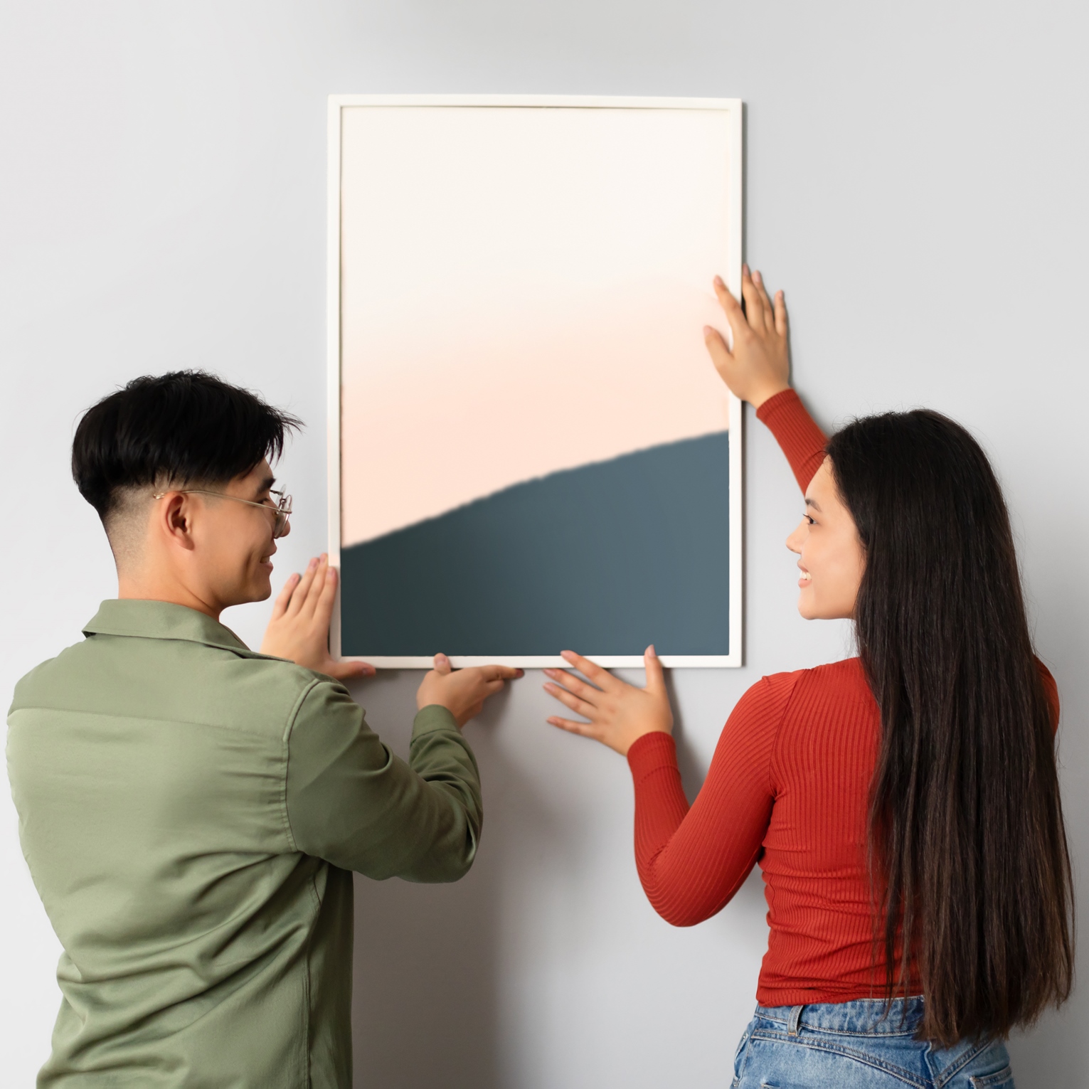
- Review with art hung. Re-check glare and tone after the first pieces go up.
If your space holds sensitive works on paper, cap light levels and limit exposure time. The Canadian Conservation Institute outlines a 50 lux guideline for watercolors and other light-sensitive pieces.
Setting Your Walls Up to Serve the Art
Painters who work around art think like handlers, not just coat applicators. They match tones between rooms so a series reads as one. They plan a soft wall in the hung zone, with a harder-wearing finish near doorways and baseboards. They look at the frame finish and mat color, then adjust the wall a half step in the other direction.
A team used to both homes and commercial fit outs can also manage project pace. They schedule the wall that hosts the focal piece first. They leave time for cure before hanging and installing fine art. They work clean, so no dust lands on the glass and varnish. That is the quiet edge that careful contractors bring to art spaces.
Make Walls Serve the Art
Choose a neutral that steps back, a low sheen that calms glare, and a light plan that respects color. Test boards in real light, then adjust a half step warmer or cooler as needed. Prep well, cut clean lines, and hang after paint has cured. With a method like this, walls will support the collection, and every piece will read true.